Sometimes you might want to break up a page into sections or blocks - this is a common thing to do with a site homepage where you might want a chunk of introductory text or an image at the top, then block of links to key content of your site such as upcoming events or blog posts, then maybe a video or other interesting content, or a block of links to partner organisations.
For an example, look at the blocks on the homepages of these Voice websites:
Bromley Well, Centre 70, or Superhighways.
By default, Voice website homepages are set up without any sections like this - but it's quite easy to create them. This is done using the Layout tab of the page, and by using Includelets to create blocks.
One thing to note is that creating blocks like this doesn't really make sense if you want content in different columns on your page - because the columns wont line up with the blocks. It only really works if you put everything into the Content column, so it appears linearly on the page.
Background Begin and End Includelets
The key to making this work are the Background Begin and Background End includelets. Add these in a pair to create a block with a background colour or image. All includelets between the Begin and End includelet will have that background.
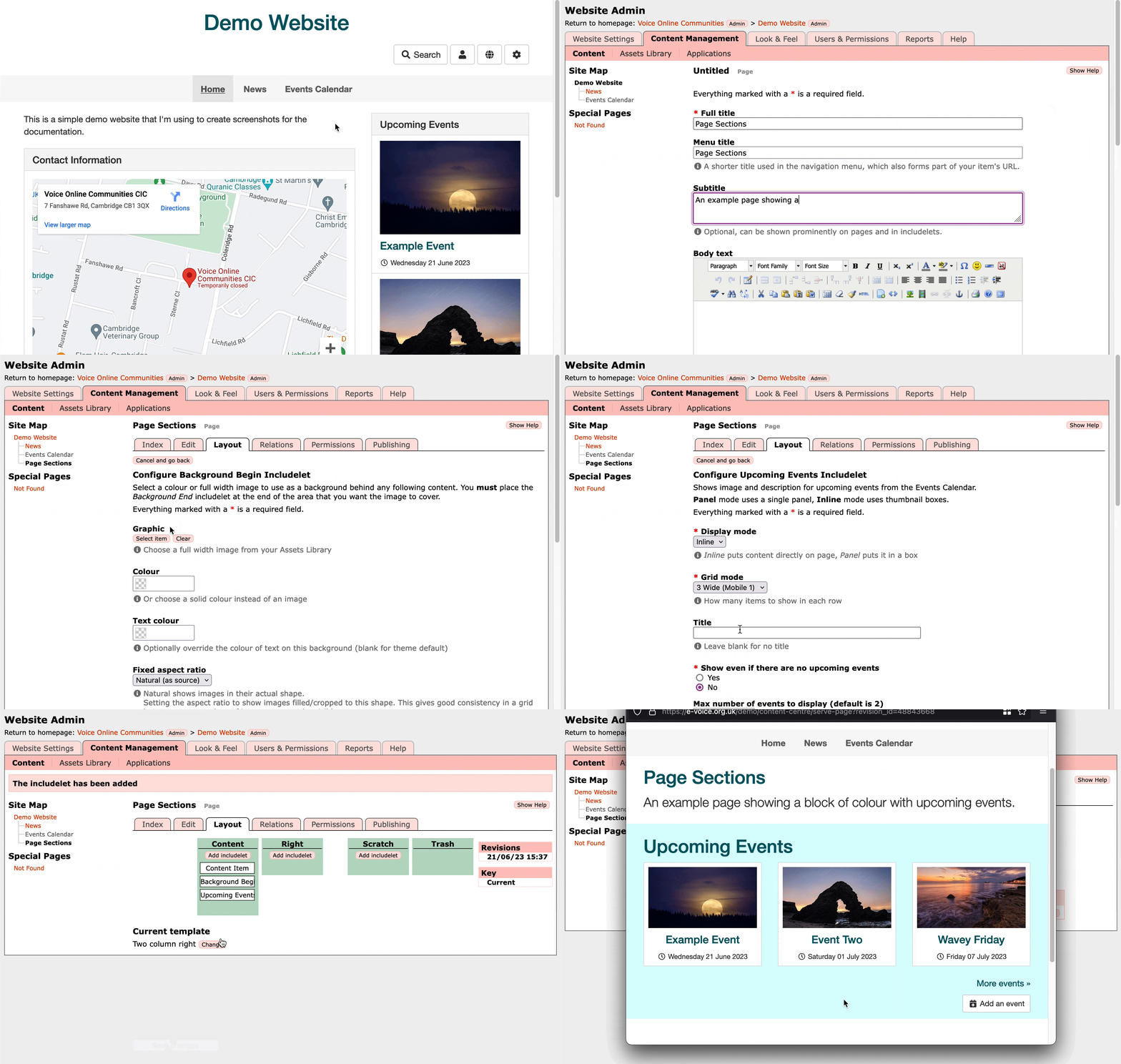
So, for example, if I wanted a block of upcoming events on my homepage on a blue background, I would go to the Layout tab, add the Background Begin includelet and configure the background colour, then add the Upcoming Events includelet in Grid mode, and then add the Background End includelet to close that colour block. Thus, the includelets on the page would then be in this order:
- Content Item (i.e., the WYSIWYG content for the page)
- Background Begin (to start the blue background)
- Upcoming Events (to show the grid of events)
- Background End (to finish the blue background)
Note: It is vitally important that for every Background Begin includelet you have a Background End in the same Slot. If your Begins and Ends are unmatched you will break the layout of the page!
Example Grid of Events on a Blue Background
In this example, on a website which has the Events Calendar app enabled with some events in it, I create a new page and use the Background Begin/End and Upcoming Events includelets to create a block of colour with a grid of events on it.
Changing the Size of the Background Section
The coloured area created by the Background Begin and Background End includelets is set by whatever you put between them. If you add them to your page with no includelets between them then it will be invisible as there's nothing to put onto the background!
If you want to force the size of the background then in the Background Begin includelet you can set an Aspect Ratio. This can be useful if you want it to show an image block with no content over it - but be warned that if you do have content over then setting an aspect ratio can mean that at some screen sizes the content might not fit over the background!
Background Images
Instead of selecting a block of colour, you can instead choose a background image from the assets library. This will be displayed scaled/cropped to fill the area required, so make sure that the image is of a suitable size and resolution.
Multiple Blocks
You can have multiple Background Begin and End includelets on a page, each with a different colour or image. There's no limit - just make sure you match up the Begin and Ends so you don't break the page layout!
Ideal Includelets
Typically for a colour block to look good, you probably don't want to use an includelet in Panel mode on it. They tend to look better if you choose Inline mode. (You are welcome to try both of course!)
If you want to add a block of text over a background then you can use the Custom Content includelet to do this.
If you want to create content on the page that uses a grid or thumbnail blocks, then the Carousel, Accordion, or Grid includelet is great for this. The Grid mode in particular looks great on a background colour.
If you are using it to create blocks with links to other content on the site, then Upcoming Events, Latest Posts, and Filtered Item List are great for this.
Adjusting the Spacing
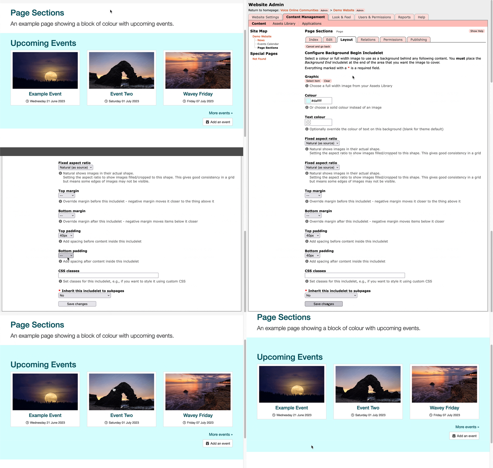
You might find that once you've added your content in a block, that the spacing around the colour isn't big enough. You can improve this by setting the Top and Bottom Margin on the includelets inside the block, or setting the Top and Bottom Padding on the Background Begin includelet itself.
- Setting the Margin changes the space outside the includelet.
- Setting the Padding changes the space inside the includelet.
In this example I increase the Padding on the Background Begin includelet so that the blue border extends further above and below the Upcoming Events includelet.
I want a block to touch the navbar but there's a gap!
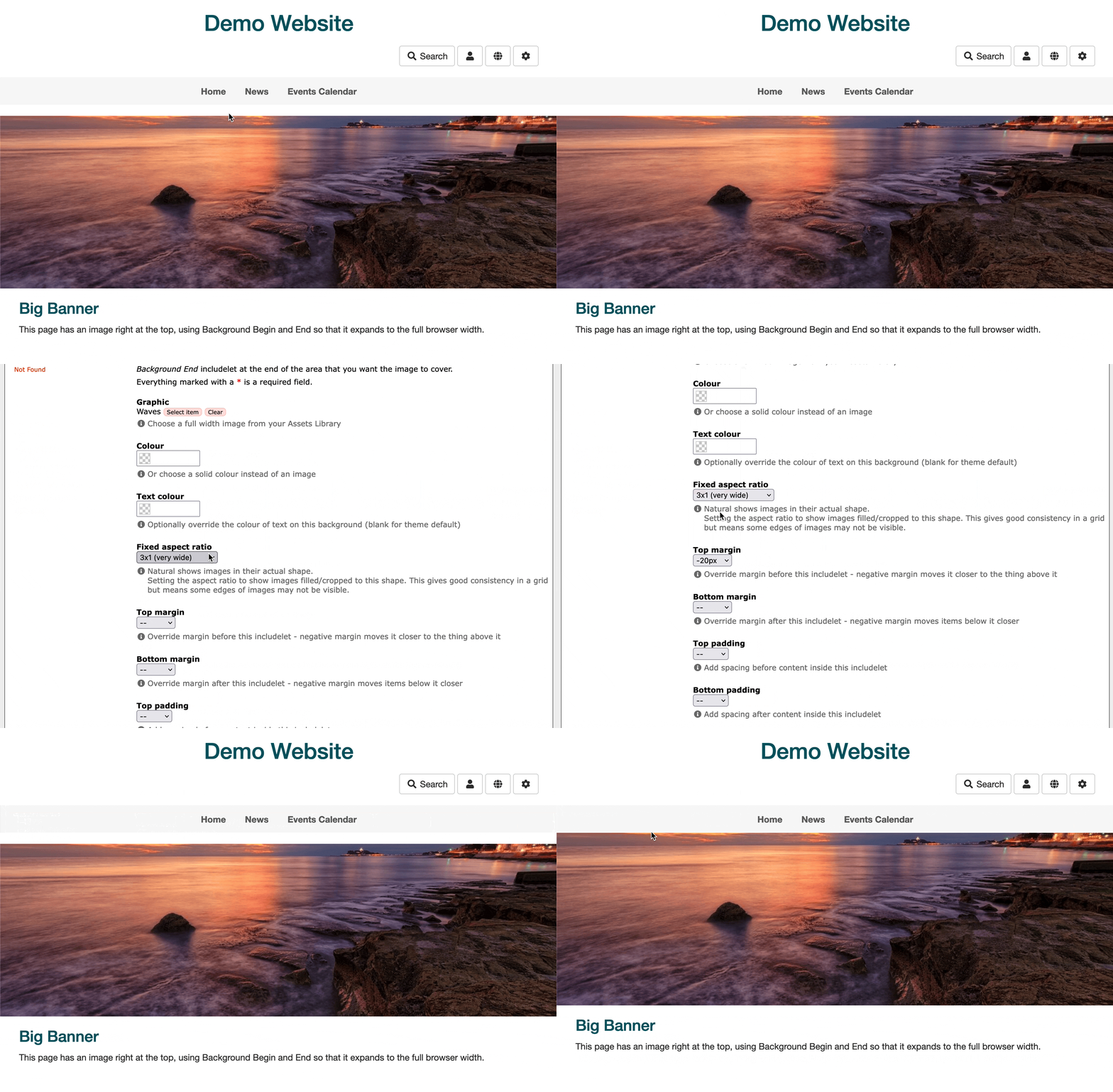
If you want to start your page with a colour or image block, you might find it annoying that there's a gap between the navbar and the colour block, even if you put the Background Begin right at the top of the Content slot.
This is because the Fresh theme (and others) add a 20px margin below the navbar. This is usually what you want, but if you're adding colour blocks it might not be!
To get around this you can set a negative margin on the Background Begin includelet. This may seem like a weird concept - and yes it is! Basically setting a negative top margin on an includelet moves it up the page by that many pixels. If you set a negative bottom margin then this moves content following the includelet up the page by that many pixels.
In this example a set a top margin of -20px in order to close the gap between the navbar and the background image.


